How to properly use PyPlots in LaTeX
In the series “How to waste time with LaTeX, pt. $\infty+1$” here’s another one. Todays mission: Embed plots done in Python into a LaTeX document, have it scalable, whilst keeping fonts and styling consistent throughout the entire document.
That sounds very easy, right? Well, I soon found out it isn’t.
Preliminaries
I’ve done most of my development work and analyses in Python. There are already quite a few plots I’d like to just export. Plotting is done with Matplotlibs’ PyPlot. It even provides a PGF Backend. How great is that! One can simply save the plots into PGF files and include them (provided the presence of according packages) like any other graphic. Work’s great, looks good and has proper support of PyPlot.
Okay, so where’s the problem? I might like to scale images from within LaTeX. That’s where it gets tricky, since, even though it’s only a textual description of the image, the entire thing gets scaled – including fonts. You might find loads of tricks and hacks how to compensate that, but I found, that it’s quite error prone.
Oh, and one more thing: If you don’t care about too complex stuff: It might be easier to use the vanilla PGF Backend and hardcode the size of your graphic as you want it + all the font sizes and styles. All the stuff below happened because I want that done by LaTeX!
Save PyPlots to TikZ Here’s what I came up with. It’s still a work in progress, but it works good for now and the results are very acceptable.
First, let’s look at the setup. I have my LaTeX stuff all in one folder, with sub-directories build (how want’s to spam the source folder…) and graphics. Within the latter, there’s a data directory with files filled with numbers of all sorts (csv-ish) and a scripts directory containing small scripts that “make” plots. Obviously I don’t want to run all these scripts individually by hand and, as stated in the preamble, I want consistent styling. That’s all done by a wrapper script + a small “library”.
|
|
Here’s my small library, that is used by the plot scripts. Throughout my thesis I’m referring to four classes of “things” and compare them. The plot style should obviously be the same, so eventually I could drop the legend on each individual figure. The convention is (for now) to use one line style per “thing” and one marker per metric (be it Precision, Recall, F1-Score, …; not implemented yet). I can easily extend the style for my “things”. Here’s that library thing, there will be more in the future.
|
|
That’s straight forward I think. You’ll see it in action in a sample plot script:
|
|
Standard PyPlot stuff. It doesn’t need any further explanation I guess. Maybe one thing: Note, that the legend gets no parameters. That’s intentional, the positioning is done in LaTeX, since PyPlot doesn’t support positioning the legend outside the plot. Okay, I hear you screaming… It can be done, yes, but only by fiddling with funny offsets. Try it, it won’t work as expected in LaTeX. Now that I run that wrapper script, this and other plot scripts will be executed. Each of those will produce graphics with the script name.
Okay let’s move on to the LaTeX side of things. Or should I say LuaLaTeX? Sorry, should have mentioned that earlier: I use Lua… I think, that it might work (with some adjustments) in plain LaTeX, too. In my preamble I have this:
|
|
The comments should explain most of what happens. Height and width is now set dynamically. The Height results from the width multiplied by the golden ratio. Through a parameter, that can be changed in individual cases. Let’s put it in action and see how it works:
|
|
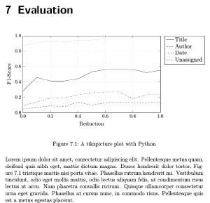
Ahhhh, great. All the dirty stuff is left behind, and from within the document it’s almost not noticeable what happened earlier. Here’s the result:

Possible Improvements
Not everything you do in PyPlot is translated (properly) into TikZ, or it can’t. Also, not everything TikZ can do, PyPlot can. Just compare the variety of line styles (Section 4.7.2) that could be possible, whereas PyPlot only gives you four options. I’m tempted to somehow find ways to utilise this. After all, the goal here is not to match PyPlot exactly, it’s to have LaTeX handle all the rendering!
Also, the LaTeX preamble code is messy. That needs cleanup and there could be more features. For now it’s fine though. The legend seems to screw with the boundaries used for the width though. Since I’m dropping those anyway, I don’t care.
Conclusion
Okay, I hope you found some of the information helpful. Maybe you want to share your “plot p(y|i)peline” or see improvements in what I presented above.
Thanks for reading.